Coca-Cola : Brand Language Precision at Global Scale
Coca-Cola: Brand Language Precision at Global Scale
Coca-Cola is the world's most recognized brand. The challenge wasn't creativity it was precision.
Every pixel, every transition, every color nuance had to match decades of brand language work, from the Spencerian script to the dynamic ribbon to the condensation effect on the bottle.
Working with the strictest visual identity guidelines in advertising, Swati's role was to translate AI animation into the brand's existing visual vocabulary. This required deep research into Coca-Cola's historical brand language and pixel-perfect execution.
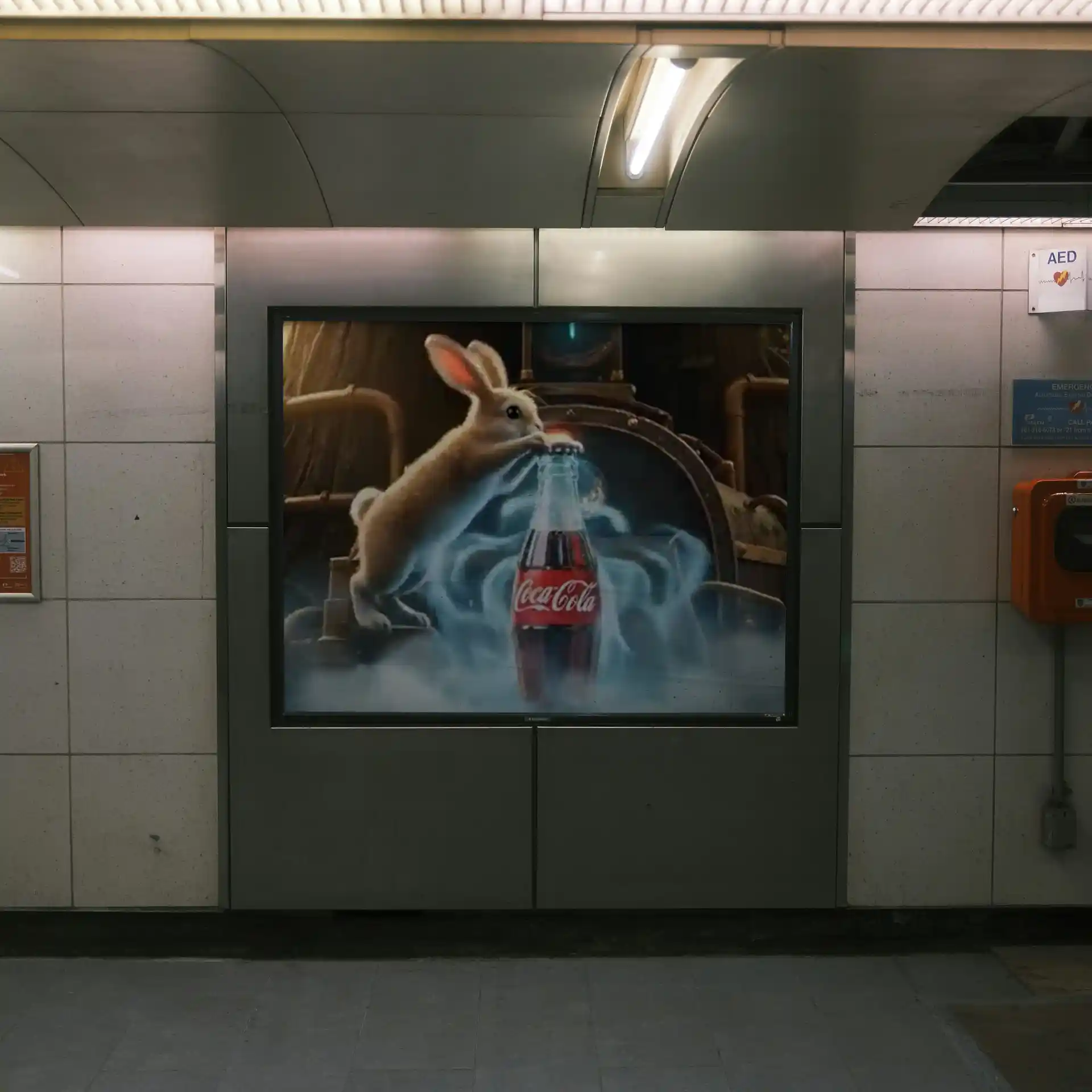
Iconic Red Moment
The Coca-Cola red (Pantone 186C) appears with signature dynamic transitions—the precise ribbon motion that consumers expect.
Iconic Red Moment
The Coca-Cola red (Pantone 186C) appears with signature dynamic transitions—the precise ribbon motion that consumers expect.
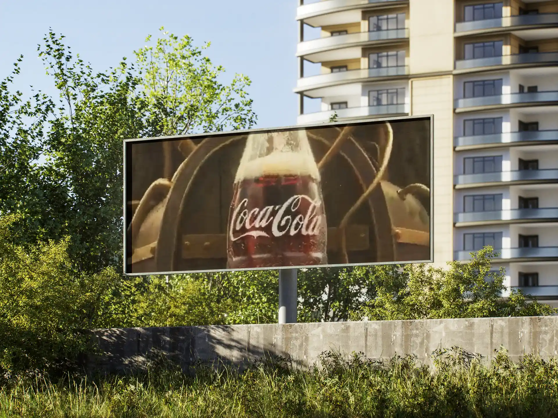
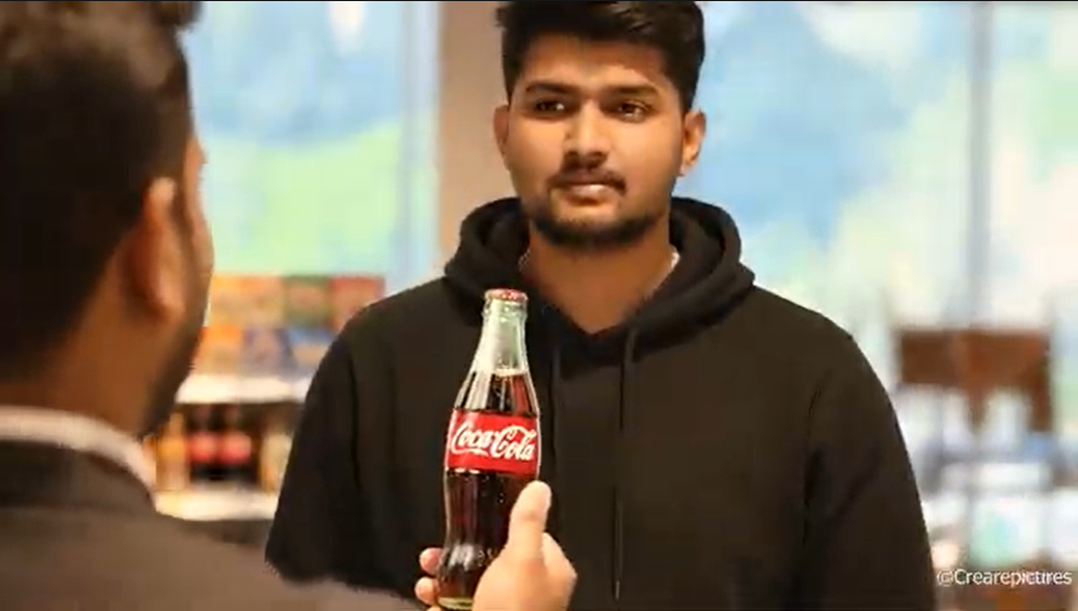
Spencerian Script Identity
The Coca-Cola script appears with perfect letter spacing, serifs, and styling—the exact typeface from every bottle and ad globally.
Spencerian Script Identity
The Coca-Cola script appears with perfect letter spacing, serifs, and styling—the exact typeface from every bottle and ad globally.
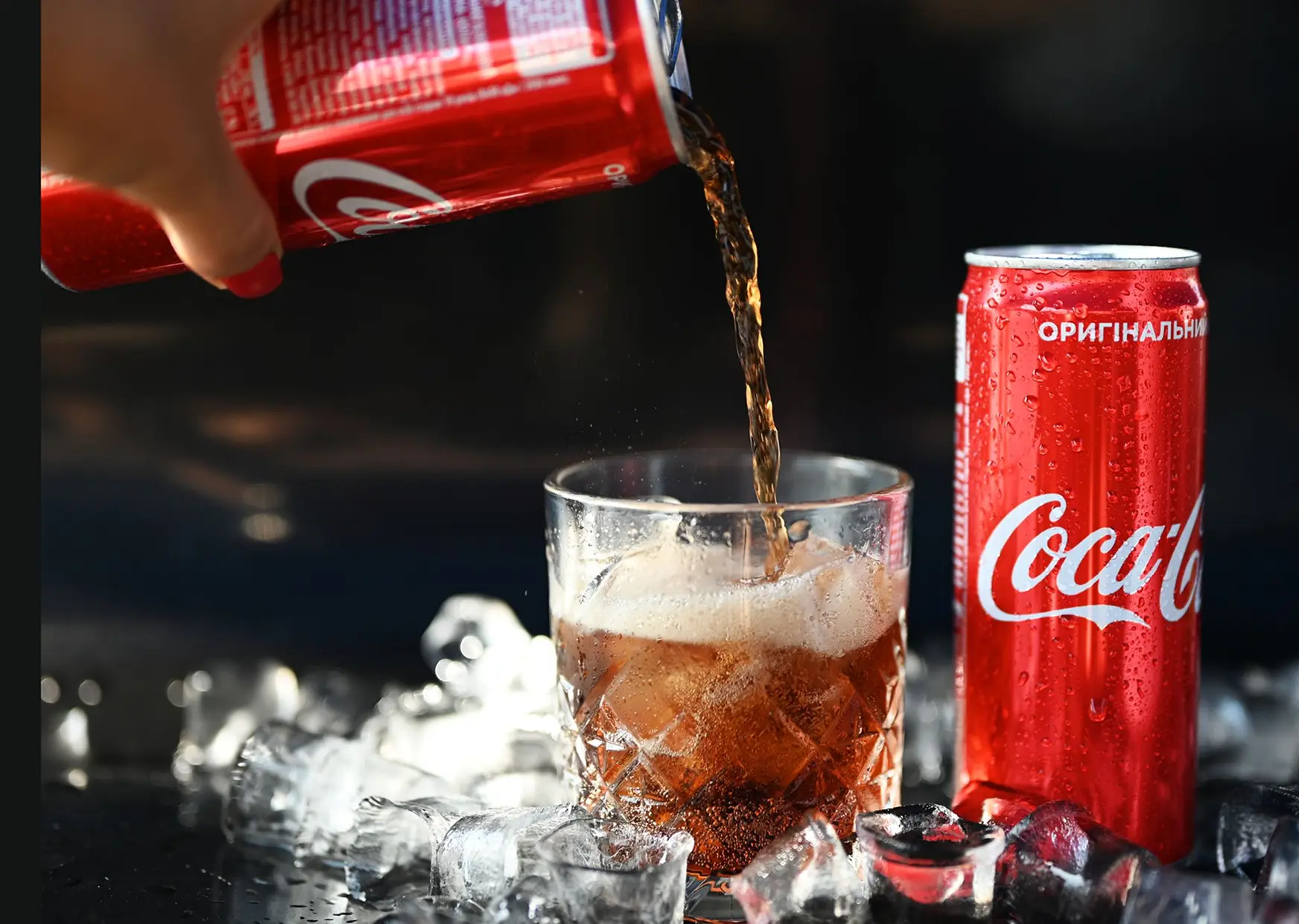
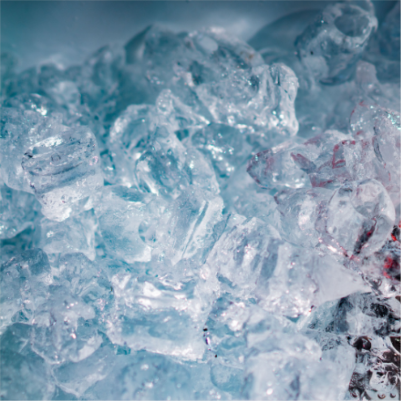
Bottle Condensation & Refreshment
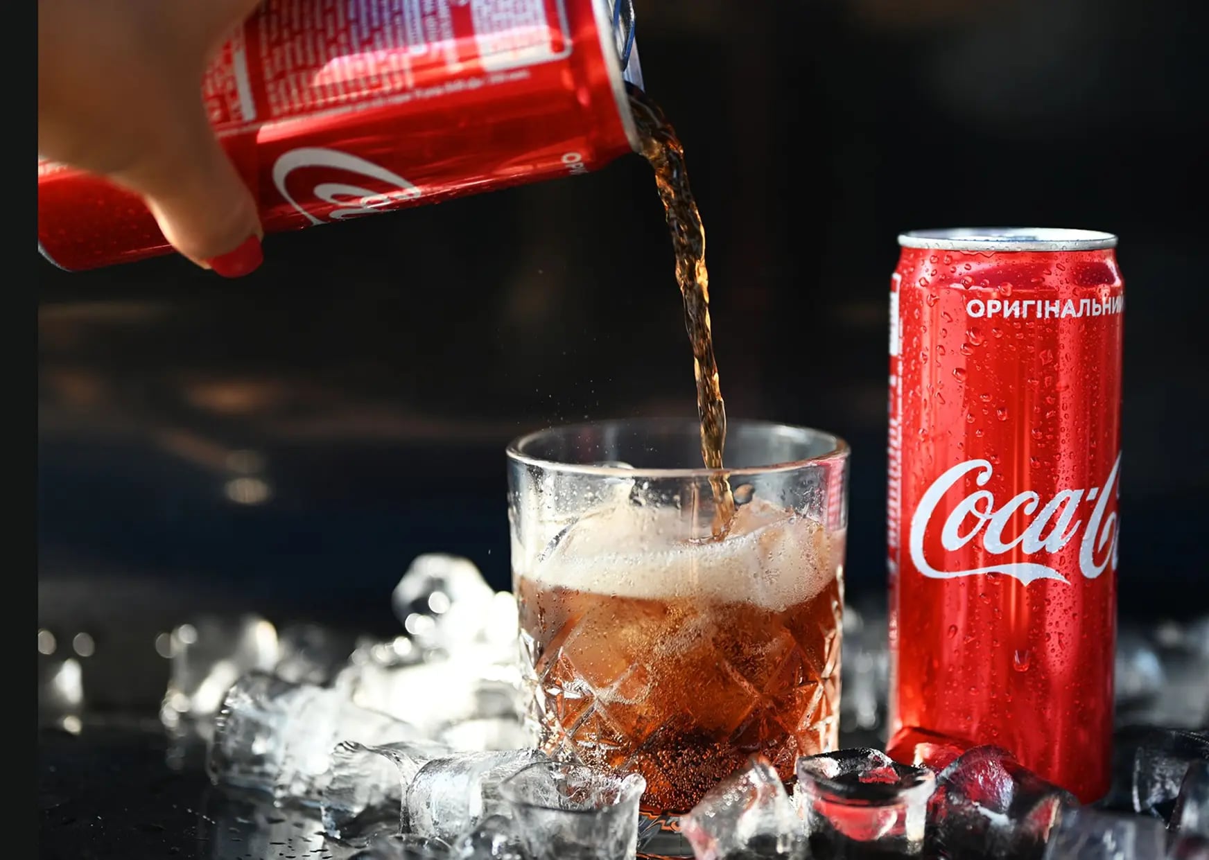
The bottle emerges with realistic condensation, ice particles, and that signature 'refreshment' feeling. Every water droplet position matters.
Bottle Condensation & Refreshment
The bottle emerges with realistic condensation, ice particles, and that signature 'refreshment' feeling. Every water droplet position matters.
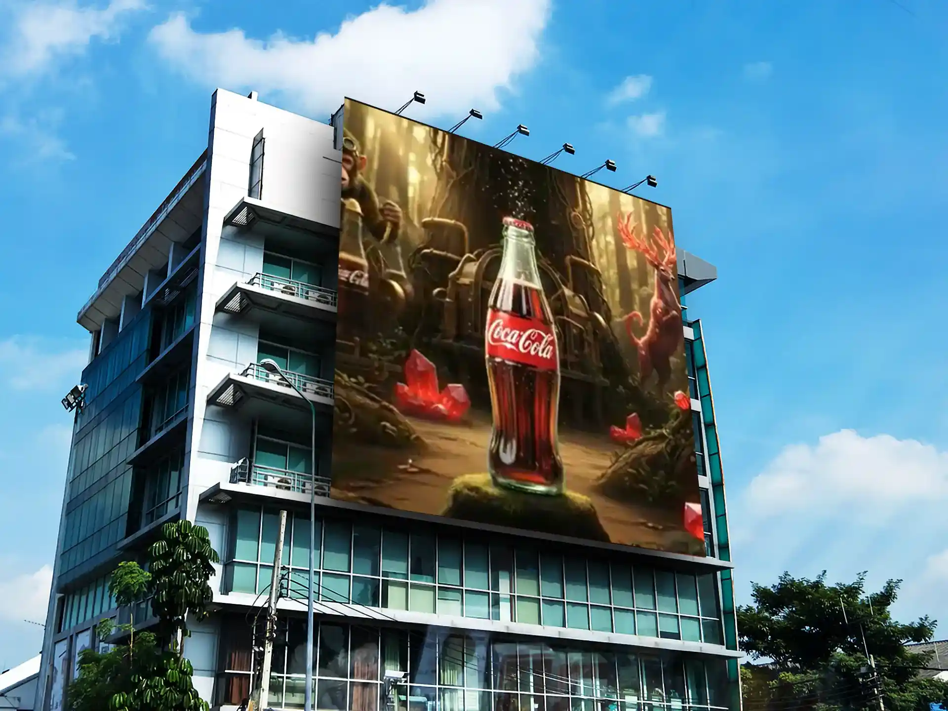
Design Thinking
We studied decades of brand advertising to decode Coca-Cola’s core visual and motion language. Precision in color, motion, and composition ensured every output stayed perfectly brand-consistent across formats. Within these constraints, we introduced subtle AI enhancements to create fresh yet compliant visuals.
Design Thinking
We studied decades of brand advertising to decode Coca-Cola’s core visual and motion language. Precision in color, motion, and composition ensured every output stayed perfectly brand-consistent across formats. Within these constraints, we introduced subtle AI enhancements to create fresh yet compliant visuals.
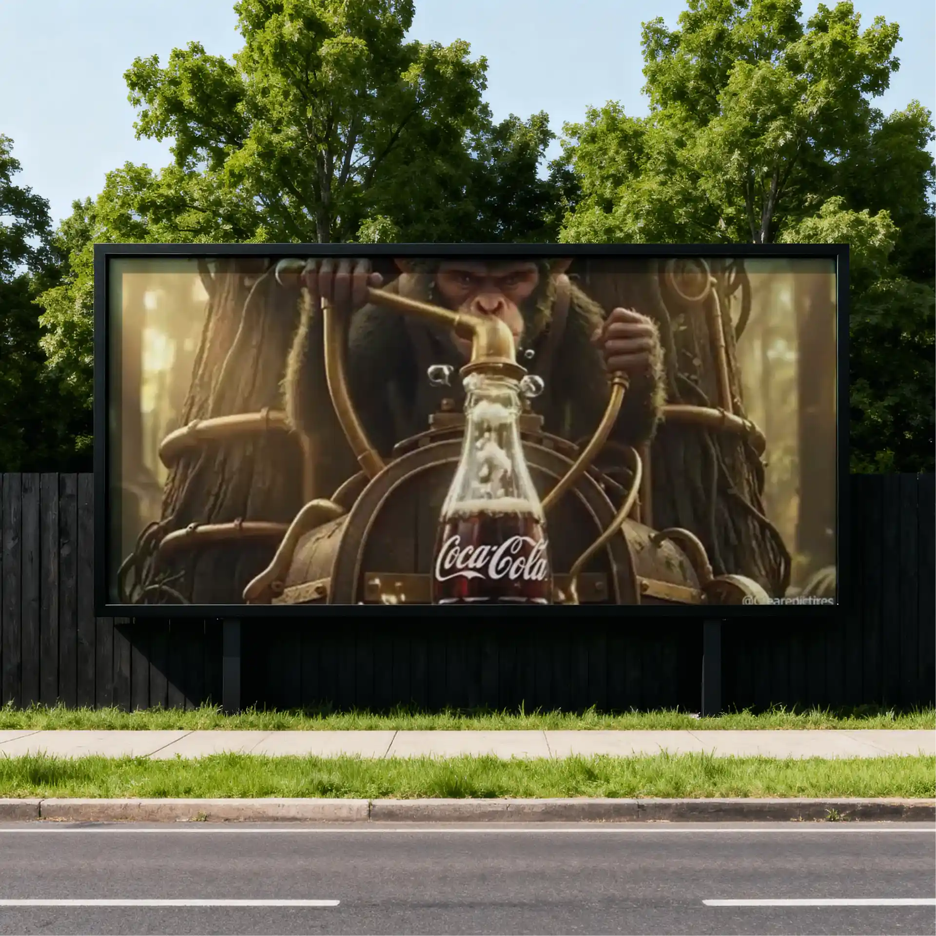
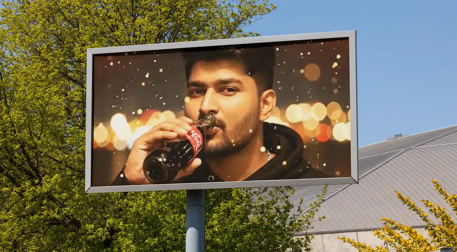
The Finished Product
The Coca-Cola campaign delivered global-standard precision, with five rounds of revision ensuring pixel-perfect alignment. The video was approved for distribution across 15+ markets. 15+ — Markets Approved
The Finished Product
The Coca-Cola campaign delivered global-standard precision, with five rounds of revision ensuring pixel-perfect alignment. The video was approved for distribution across 15+ markets. 15+ — Markets Approved
"We were cautious about AI animation for our brand. Swati proved it could deliver not just creative freshness but actual brand-language precision."
- Coca-Cola Global Marketing Director, 2023"We were cautious about AI animation for our brand. Swati proved it could deliver not just creative freshness but actual brand-language precision."
- Coca-Cola Global Marketing Director, 2023Next Projects
View all here